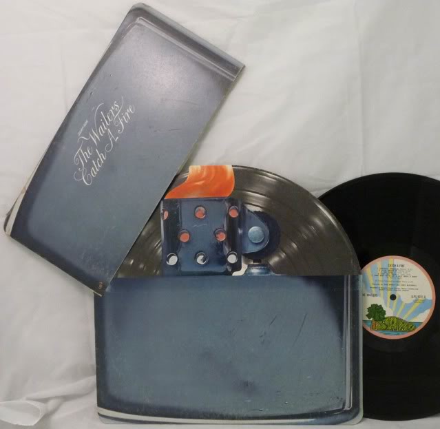

Q: You mentioned “Catch a Fire,” and the Neville Garrick covers. Are there other things like that, which you could name as visual influences?
A: Old jazz album packaging is always an influence. Not just in this but a lot of other stuff I do. Particularly the old Blue Note era stuff, which are some of the best albums ever designed. In history. I try to bring a little bit of that feel—just in like the font choice, the simplicity. Not to educate people exactly, but just to let people know there can be some restraint. That something can be nice and simple and clean and still be really beautiful. It doesn’t have to be a 3-D logo with like graffiti, jewelry and stuff.