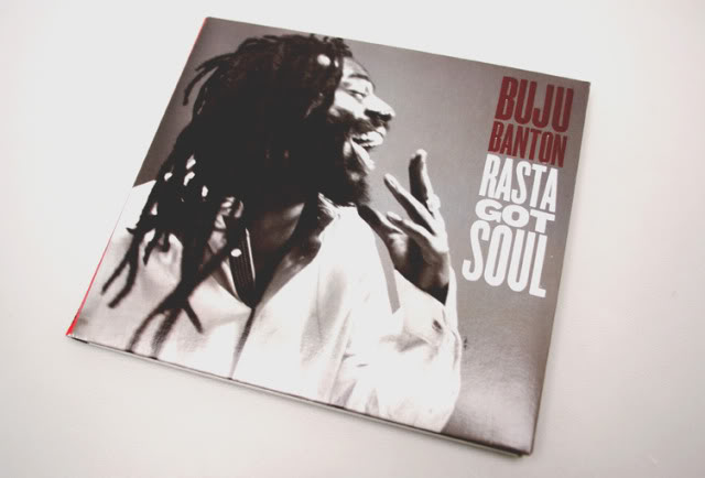
Q: Funny you said ‘classic’ because the Rasta Got Soul cover—it’s not exactly retro–but it has a throwback feel with the black and white photo…
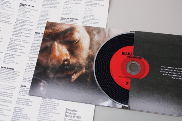
A: Yeah, whole idea for the album was like a ‘back to the roots’ kinda thing so I went with that idea. Not retro, but retro in the sense that it was clean and wasn’t over-designed. A lot of–especially reggae album covers you see–they’re really over-designed. I don’t want to say like Pen & Pixel bad but some of it’s a little over the top and doing something like that wouldn’t have really fit the music and the whole vibe of the album. I just wanted to do something simple and reminiscent of the old vinyl packaging, even down to the grooves on the actual CD to give it that feel. There was some really great photography by Jonathan Mannion and the shot that we picked for the cover was something kinda like in between. Me and Jonathan had some–not exactly differences–but he was like that was just one of those in-between shots. But that was why I liked it, cause it was an unscripted moment, it caught him in this natural state where he was kinda relaxed and wasn’t posing or anything like that. You know, there was some joy in that photo, that’s why I chose that one.
Q: That sounds like you were looking at the photography a lot more like an editorial art director then the conventional way music photography is done; very portrait, kind of managed, controlled…
A: Yeah, I didn’t want to do something too staged or too slick. I wanted something more telling than just: This is a picture of Buju Banton. You know, we’ve already seen his picture, let’s do something more raw and revealing.
Q: You worked on the previous LP as well, what was the difference?
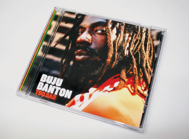
A: Well Too Bad was a dancehall record, you know, a completely different vibe. Even like the location was kind of rough and gritty. The shot we picked was tough and went with the title, so I think that worked well with a dancehall album, a street album.

